Tuesday 12th March 2019
NEA Part 1 - Media Language and Representations Analysis
1. The shot that they used is a long shot, so it can showcase the entirety of the planet. The colours are dark on the front cover, which can connote mystery and intrigue. At the top of the front cover, the title is bold and large, which grabs the attention of the reader. At the bottom of the front cover are three cover lines, which provide short summaries of stories that appear later in the magazine. Also, the image of the planet makes it clear to the reader about the contents of the magazine and it could make the reader want to read the stories in the magazine, if they are interested in astronomy.
2. The shot they used on the front cover is a head and shoulders shot, which allows the reader to clearly see the focused facial expression of the model. The model on the front cover of the magazine is a young white female, which portrays the stereotypical person who attends university or who is interested in education. The colours on the front cover are very bright, as white is predominately used and the model's bright red lipstick stands out against the pure white background. Also, the title is bright red and bold, which makes it easy for the reader to notice what the magazine is potentially about because it stands out. The body language and facial expression of the model suggests that they are focused on balancing the books and the apple on her head because of her fixed sight on the books.
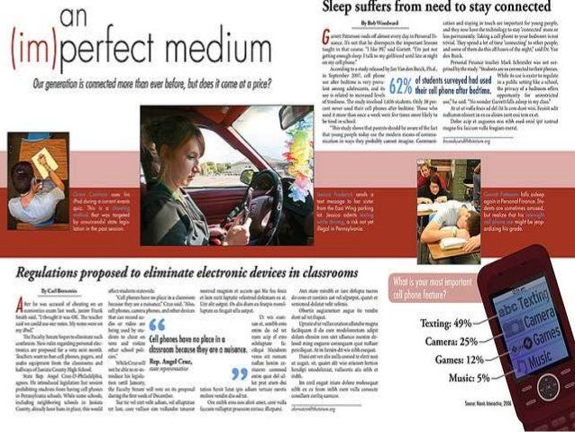
3. In this double spread article, the shots they have used include: an over the shoulder shot and a medium shot. The image at the centre of the article stands out from all of the rest because it's larger than all of the others, so it's intended for the audience to see this picture as soon as they look at the article. This could be the case because it shows a woman texting while driving, which is a common thing in society today, so the reader can relate and understand the article more. Also, the title is in bold and in a large font, so it catches the reader's attention immediately and allows them to understand what the article is about. The colour scheme on the double spread article is bright with white predominately being used and bright red too. All of the models in the photos are white and young, which could reinforce the stereotype that the younger, white generation are fixated on their phones. The model in the centre image is represented negatively because she is seen texting while driving.
4. In this double spread article, the shot they have used is a medium shot. The model in the photo is a white young woman, which could make the article appeal to women because they can relate with the model and her views about what makes a good interview. The colour scheme in the double spread article is bright, due to the majority being white and the title being bright red. The title is in the centre of the article, in order to catch the reader's attention and make them interested in the contents of the article. Also, the title is in a large font and is bright red, which could catch the reader's eye even more. The body language of the model suggests that they are happy, due to the thumbs up gesture and wide smile. This brings a warm mood to the article, which makes the reader feel welcome and happy themselves.
 |
 |

No comments:
Post a Comment