Tuesday, 30 April 2019

NEA Part 8 - Casting

Tuesday 30th April 2019
Casting

Introduction:
From this task, I intend to decide my cast for my magazine and weigh up the pros and cons for each. This will help me understand if they're suitable or unsuitable for the magazine.

Actor's Name:
Ciaran Gunning

Key Information:
He is an 18 year old white male.
He goes to HACH sixth form and works part time at the weekend.
He has short, blonde hair and is 5ft9.

What makes this person suitable:
Ciaran is suitable to appear on my magazine because he's my brother, so it will be easy to do a photo shoot with him because he'll have no choice and it will be easier to discuss when and where the photo shoot will be. Also, he has experience with football, so it will be easy to take photos whilst he does certain football skills and tricks.

What makes this person unsuitable:
Ciaran is unsuitable because he's not the same age as the target audience (10-13) so it will be difficult for the audience to relate. Also, my brother goes to school during the week and works on the weekends, so it will be difficult to schedule a time and date for the photo shoot. Due to my brother being white, my magazine may not appeal to audiences of different ethnicities. 

Actor's Name:
Ryan Birch

Key Information:
He is a 14 year old white male.
He goes to HACH.
He has short, blonde hair and is 5ft.

What makes this person suitable:
Ryan is suitable because he is my friend so it will be easy to schedule a date for my photo shoot because we're always in contact with each other and speak to each other daily. Also, Ryan has experience with football because he plays for a team, so he'll be suitable for my football magazine. Ryan is also almost the age of the target audience so it will be easier for the audience to relate.

What makes this person unsuitable:
Ryan is unsuitable because he may be busy on the weekends, as he plays for a football team and he's busy during the week because of school. Therefore, it may be difficult to agree with a date for the photo shoot.

NEA Part 7 - Locations

Tuesday 23rd April 2019
Location Information

Introduction:
The purpose of this task is to assess and identify potential locations that I will use in my photography. This will help me to understand the pros and cons of using certain locations for my magazine and it will help me in the future when I'm making my magazine.


Harris Academy Chafford Hundred - Field:

Address:


Sometimes the gate to the field is closed, so it's a risk on whether or not I am allowed access.

Risk 2:
On the weekends and during the school holidays, the field is often crowded, so it may be difficult to find space and a suitable time to do the photo shoot.

Risk 3:
The location is outside so the weather dictates when I do the photo shoot and if the weather is bad, it will delay the photo shoot.

Image result for harris academy chafford hundred


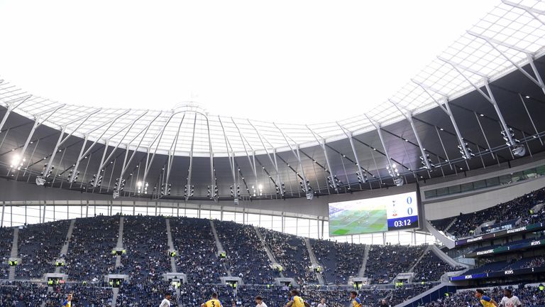
Tottenham Hotspur Football Stadium:

Address:
782 High Rd, Tottenham, London N17 0BX

This location is suitable because it's a football stadium so it's perfect for my magazine on football.

Risk 1:
It's often busy, especially on a match day, so I'll have to judge when I do the photo shoot, otherwise space will be limited.

Risk 2:
It's an outdoor location so my photo shoot will be dependant on the weather situation.

Risk 3:
The location is far away so the photo shoot could take longer then anticipated.

Image result for spurs stadium

Conclusion:
I'm going to use this knowledge in my production because I have decided what locations I will use for my photo shoots. Also, I know the hazards for each location, so I will know how to conduct my photo shoots in the most effective way possible.

Tuesday, 23 April 2019

NEA Part 6 - Product Profile

Tuesday 23rd April 2019
Product Style Profile


Learning Objectives:


  • K: the importance of sketches and planning in the decision making process of creating a magazine.
  • U: how to use sketches to influence your stylistic decisions.
  • BAT: undertake a creative task in which you start the decision making process in terms of style of your magazine.

Introduction:
In this task I will be preparing and creating sketches that should mirror what I want to do with my production. At the end of this lesson, I should understand how to use sketches to influence my stylistic decisions. Also, I should be able to undertake a creative task where I begin the process in which I decide the different styles of my magazine.


Draft 1 is for my magazine front cover. I showed it to a couple of people in my class and the feedback was positive, however they gave me constructive criticism and told me to do another redraft but use symbols instead because it would make it easier in the future for me to transfer my ideas on my plan into Photoshop. The main point I will take from this is to redraft using symbols, in order to make it more clear.

Draft 2 is also for my magazine front cover. I showed it to a couple of people in my class and they said it was an improvement from my last draft because I used symbols to show text and pictures. However, they told me to spread out the cover lines and put them on both sides of my main picture, as they were squashed on one side of my front cover.

Draft 3 is for my magazine front cover. I showed it to a couple of people in my class and they said it was a good improvement from my last draft because I spaced out the cover lines more and I included a freebie at the bottom of my front cover, which would appeal to the target audience (10-13 year olds).


Plenary:
I found this step useful because it allowed me to understand what my front cover may look like and what to include on the final product.
Peer feedback was really useful because it allowed me to improve my draft, as they gave me constructive criticism on my front cover and they gave me positives, which allowed me to understand what I should keep or change in my final product.

Tuesday, 2 April 2019

NEA part 5 - My mood board

Tuesday 2nd April 2019
My Mood Board

Learning Objectives:

  • K: the advantages and disadvantages of using a mood board to inspire content of new media product.
  • U: how different types of images and fonts can affect the way audiences consume media texts.
  • BAT: produce a mood board that illustrates your initial ideas for your media product.
  • CO: Use media terminology throughout.

  • What brief did you choose?
  • What are the minimum requirements for your chosen production?
  • What is the target audience as prescribed in the brief?
  • What is your target audience for the product you're creating? (this needs to link to the audience profiling post).

The brief I chose was brief one, which is an educational magazine. The minimum requirements for my magazine are five original pictures, a title, a strap line, a bar code, one main cover image, three cover lines and a 300 word double page spread article. The target audience for my brief is 10-13 year olds. My target audience for my magazine from my research was 14 year old males, who are interested in football.

Introduction
In this task, I'll explore different types of images, fonts and colours to use in my magazine. By creating this mood board, it will allow me to understand my target audience more and what content to include in my magazine.


Image result for football magazineImage result for football magazineImage result for football magazineImage result for soccer magazine close upImage result for close up soccer ballImage result for mid shot soccer player

Image result for soccer
Image result for close up soccer
Image result for football magazine front coverImage result for stadium


Image result for magazine fonts sport


  • How did they helped you define content for your product?
  • What will be your overall colour scheme of your production?
  • What kind of images/shots would you use in your production?
  • What kind of fonts would you use in your production?
  • What kind of mise-en-scene would you use in your production?
  • What kind of intertextuality would you use in your production?
  • Which media theory(ies) are you likely to use in your production?

1) This mood board has helped me decide what type of content appears on a football magazine and the types of shots and fonts for the front cover.

2) The overall colour scheme of my production will mostly include bright colours such as, blue, green and white.

3) In my production, I will use close ups and full body shots because in my research I have discovered that most football magazines use these types of shots. Therefore, I will use close ups and full body shots to make my magazine appeal to my target audience and be as realistic as possible, so it looks like a real football magazine.

4) The type of font I will use for my front cover will be bold and large, as it will make my magazine stand out and appeal to my target audience. Also, the large, bold fonts usually appear on the front cover of football magazines.

5) In my magazine, the mise-en-scene will include a football kit and a prop I will use will be a football.

6) A kind of intertextuality I will use in my magazine will be a celebrity football scandal on one of my tag lines. Therefore, a wider audience would be interested in my magazine because of that celebrity.

7) In my magazine, I will use Blumler and katz' media uses and gratification theory because I intend to inform my target audience give them a source of entertainment through my football magazine.